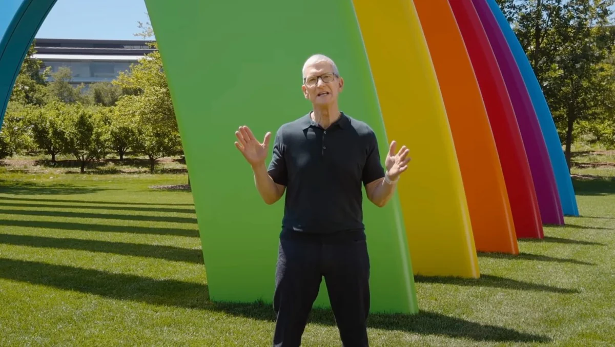
At WWDC 2026 Apple admitted what many users were quietly (and loudly) saying all year: Liquid Glass needed tweaking.
If you’ve been squinting at translucent panels and trying to parse text through a swirl of background content, the company’s answer is both simple and flexible — a new slider that lets you dial Liquid Glass anywhere from “Ultra Clear” to “Tinted Glass.” Apple also says it’s changing how Liquid Glass is built under the hood, diffusing “complex content” behind UI panels so foreground controls have clearer separation from what sits behind them. And importantly: you won’t be forced into the new look.
What’s changing, exactly
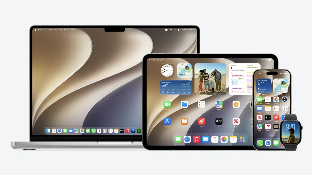
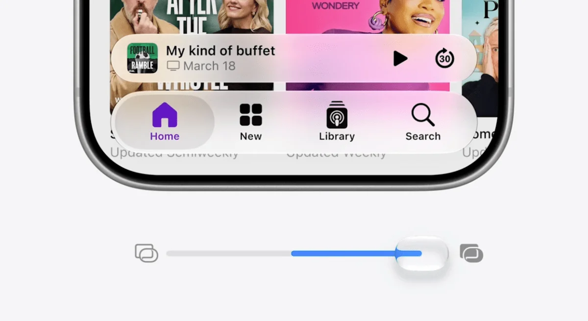
On iPhone and Mac the headline feature is the transparency slider. On macOS 27 Golden Gate’s developer beta, the slider appears in Appearance settings and starts you in the middle — a subtle sign Apple thinks the original, extra-seethrough approach went a little too far. Push the slider toward frost and the distracting translucency softens; slide it the other way and you get that ultra-glassy, crystal-clear effect.
Apple also plans to give app developers hooks so those customizations work inside their apps at launch. That means third-party apps can respond to your chosen level of Glass, rather than forcing a single aesthetic across the board.
Design changes extend beyond just translucency. Apple is refining app icons to be sharper and more cohesive — a response to complaints that last year’s icon refresh sometimes looked soft or blurry. The motion-based shimmering effect introduced with iOS 26 has been removed in the iOS 27 beta, and many built-in icons have been tuned to look crisper and more detailed.
On the Mac, Golden Gate pairs the slider with other UI adjustments: edge-to-edge sidebars, slightly larger corner radii for windows, and a more uniform toolbar at the top of certain apps. These tweaks are small individually, but together they help the Mac feel less like a stylistic experiment and more like a practical workspace.
Why Apple is backtracking (and why it matters)
Liquid Glass was undeniably bold — a design leap meant to make interfaces feel lighter, more modern and, yes, a bit magical. But magic loses charm when it interferes with readability and everyday use. The feedback loop was loud: users found some elements hard to read; reviewers described the effect as distracting on handheld screens.
Apple’s response is a textbook case of iterative design. As the company put it during the keynote: “Like with all major design updates, there is a natural process where we take a bold leap forward, and then we continue to iterate.” That iteration now looks like giving users control over the intensity of the effect and reducing visual noise behind UI panels.
Accessibility remains a consideration. The classic Reduce Transparency option is still available for users who prefer a completely simplified look, though Apple stopped short of letting you make every panel fully opaque from the new slider alone.
Early hands-on impressions of Golden Gate show the default, slightly frosted setting is a reasonable compromise — it keeps the aesthetic without stealing focus. Still, some critics point out oddities that persist, like a new battery icon that’s less legible than the old one, and missing refinements in window management that power users want.
For context, this isn’t Apple’s first adjustment to Liquid Glass. The company quietly softened some effects in iOS 26.4 when pushback first mounted, and macOS refinements have continued into this cycle as well. If you want a refresher on that earlier softening, see our story about iOS 26.4’s tweaks and how Apple has been nudging the look toward legibility over the past year (iOS 26.4 softens Liquid Glass). And if you’re curious about the broader macOS 27 polish beyond the slider, there’s more on how Apple tuned Liquid Glass in Golden Gate here (macOS 27 will tune Liquid Glass and give Safari an AI tidy-up).
A design that’s here to stay
One clear message from Cupertino: Liquid Glass isn’t going anywhere. Rather than rip it out, Apple is making it configurable, more consistent, and — critically — easier on the eyes. For people who loved the original look, there’s still an “ultra clear” setting to keep things glowy. For everyone else, the frosted midpoint or reduce-transparency path will be a relief.
These changes will roll out through developer betas first; wider availability will follow with the public releases later this year. Between the slider, the icon retouching and under-the-hood diffusion of background content, Apple is trying to keep the style while removing its more intrusive edges. That’s a small, practical pivot — and one that should make everyday use feel a whole lot less dramatic.