What if your phone assistant could keep working without hogging your screen?
Google appears to be moving in that direction. Over the last few weeks beta testers and teardown sleuths have spotted a handful of user interface changes to Gemini’s floating overlay on Android: a visible 'Minimize Gemini' control so the assistant can run in the background, tighter account switching, and wallpaper-driven theming thanks to Material You and Dynamic Color.
A less intrusive Gemini
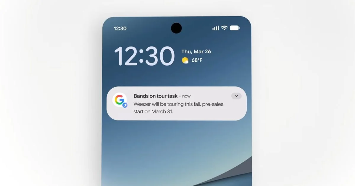
Until now, summoning Gemini on Android — via long-press of the power button or hotword — dropped a floating overlay that effectively paused whatever you were doing. That overlay felt handy for quick back-and-forths, but it also kept you locked into the session. Recent Google app builds show a clear tweak: a persistent Minimize Gemini button in the overlay. Tap it and the overlay collapses into a small floating pill, letting you continue using other apps while Gemini keeps processing or stays ready in the background.
Teardown notes suggest this button is more discoverable than earlier experiments. Previously Gemini could be minimized only while it was actively processing a request, and there wasn’t an obvious visual cue that minimizing was possible. The new button stays visible throughout a conversation, which will make the behavior far easier for casual users to find.
Reported build numbers put some of these changes in beta: variants of the Google app around versions 17.26–17.30 have contained pieces of the work. That means you may see the features in beta channels before they hit stable, and Google’s rollout appears staged rather than instant.
Color that actually matches your wallpaper
Alongside multitasking improvements, Gemini’s overlay is getting a Material You makeover. The floating bar and some chips now borrow palette tones from your wallpaper (Dynamic Color), which is most noticeable in dark mode where fields and chips shed the old gray wash. The full Gemini app still largely retains its previous styling, so the theming is being rolled out in small bites — starting with the overlay and Live button accents — rather than a wholesale redesign of the entire chat experience.
That gradual approach makes sense: a lightly tinted overlay is a low-risk place to experiment with system theming without breaking familiarity in the main chat UI. If you like to change wallpapers often, expect small color shifts in Gemini Live and the overlay.
Tools and the interface around them
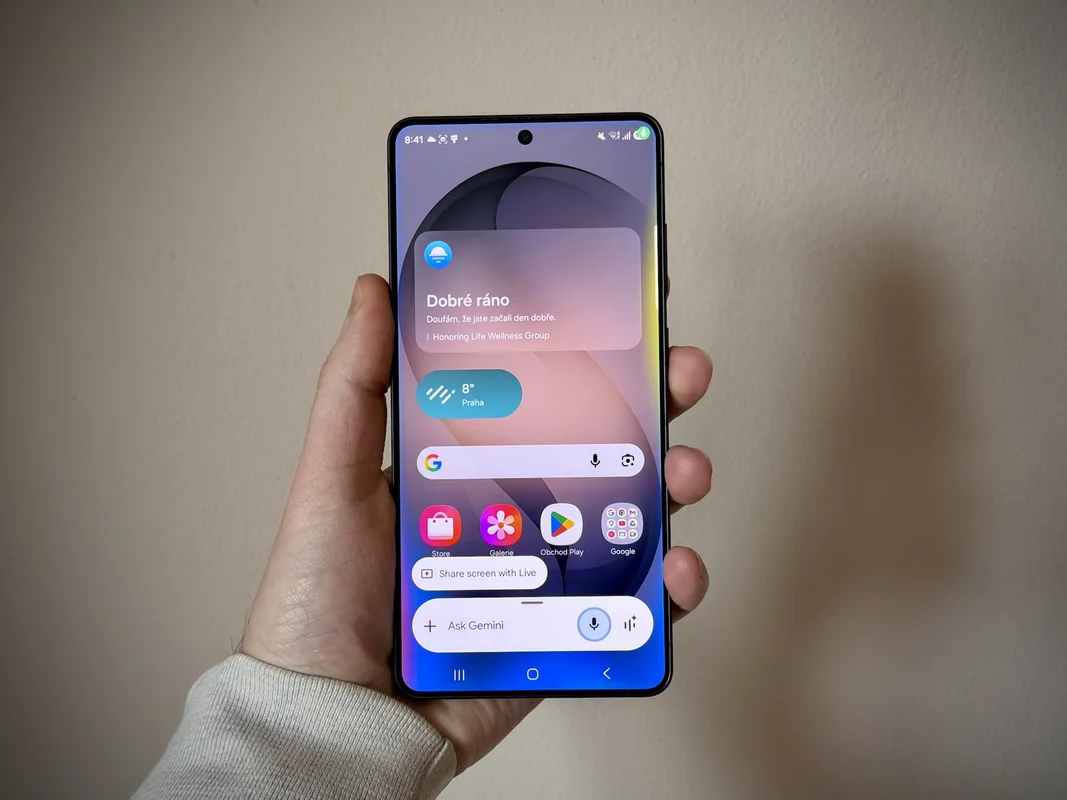
A couple of other interface adjustments have surfaced. The 'Screen content' capture option — which grabs a snapshot of what’s on your display and feeds it into the prompt — has moved into Gemini’s main carousel of attachments (alongside Photos, Camera, Files, Drive and Notebooks), making it quicker to reach. Separately, the account switcher in both the Google and Gemini apps has been tightened up; profile photos and the 'switch account' entry are now combined into a single, more compact row that uses screen space more efficiently.
If you use Gemini’s organizational features, note that Google has been adding and reshuffling tools like Notebooks into chats; that wider Gemini push across Android is part of a raft of changes that aim to make the assistant feel more integrated with daily workflows pushing Gemini deeper into Android and devices. There are also new Notebook syncs and UI touches to keep an eye on for people who rely on long-term context Gemini Notebooks and NotebookLM syncing into chats.
Not just cosmetics — but not all changes please everyone
The overlay tweaks are mostly about polish and convenience, but they arrive amid other, more contentious product shifts. Users have reported tighter usage limits and some reductions in free features since Gemini’s expansion at I/O, raising questions about how Google will balance access and cost as these AI features scale. The recent UI facelift doesn’t add big capabilities by itself, but pairing better multitasking with stricter usage rules can change how people feel about the product.
When you might see it
Parts of the redesign are already visible to beta users; Dynamic Color in the overlay and the Screen content carousel change have been spotted in builds around version 17.26–17.28, while the minimize button appeared in later beta artifacts. As with many Google feature rollouts, expect a staggered schedule: some beta testers will get changes early, others will see them in stable releases over the coming weeks.
If you prefer hands-on discovery, keep your Google app updated and try Gemini from the long-press power shortcut. If you don’t see any of this yet, a future beta or stable update will probably bring the tweaks to your phone.
The overall effect is subtle but practical: a Gemini that looks a bit more at home on your homescreen and gets out of the way when you need it to. For people who summon the assistant for quick tasks while juggling other apps, that feels overdue and, frankly, welcome.